
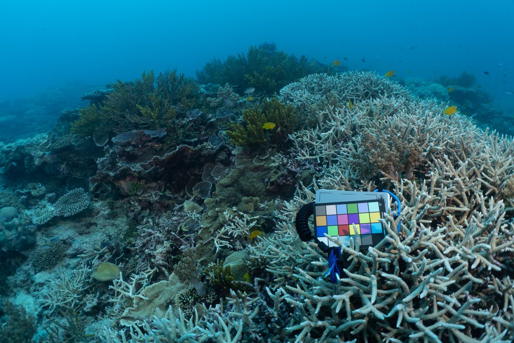
According to the ‘AIMS Reef Snapshot Summer 2023-24’ report, the southern Great Barrier Reef is most at risk of coral bleaching, with Great Keppel Island one of the highest risk areas. I will be over at the island this weekend. (Subscribe for my weekly emails to be sure to see my photographs from under-the-water, CLICK HERE.)
Since posting some AIMS water temperature data for the nearby Square Rocks (CLICK HERE), I’ve been looking for some other more southern water temperature data that is relatively up-to-date.
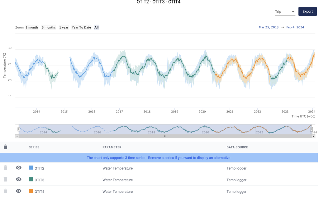
The feature image is AIMS water temperature data as recorded at One Tree Island from 2.3 metres depth from March 25, 2013, to February 4, 2024. The time series is mostly complete showing 11 consecutive summers. I’m confident this chart has caught the peak warmth for this last summer, 2023-2024, and it is from the southern Great Barrier Reef.
Again, this AIMS water temperature data does NOT show this last summer to be exceptionally warm. This last summer appears to be about as warm as the summer of 2019-2020. I know there was coral bleaching at the nearby Heron Island early in 2020. The bleaching was severe, but with full recovery within a few months.
I’ve been in touch with AIMS regarding how this data is measured. I’m very grateful for the reply from Suzannah this afternoon explaining that the temperature is recorded every 10 minutes continuously. The solid blue/green/orange line generated by their automated charting app represents the average for the week, with the light shading showing the upper and lower range values for the weekly average.
Given these measurements represent a continuous average, the data could be used to generate accumulated ‘Degree Heating Days’. However, it would appear from the ‘AIMS Reef Snapshot Summer 2023-24’ report that the ‘Heat Maps’ are instead a Bureau of Meteorology product and I’m guessing based on homogenised satellite data. I am hoping to receive confirmation from AIMS about this on Monday.
To be clear, the high-quality, location specific, temperature time series, of actual underwater temperatures that I have been posting in recent blog posts (ESPECIALLY MYRMIDON CLICK HERE), are NOT used to generate the heat maps that are being promoted to suggest the Great Barrier Reef is bleaching from elevated sea temperatures.
Just today my mother sent me a clipping from the Cairns Post with the headline ‘Great Barrier Reef Grief’ and my husband tells me the BBC is reporting that ‘75% of the Great Barrier Reef is being lost to bleaching’ with both media outlets blaming global warming. As far as I can tell the AIMS location specific data is being ignored, with a preference for contrived Bureau modelling while the bleaching percentages quoted are based on aerial surveys from out an airplane window at 150 metres altitude.
We could do so much better.
We incorporated quite a bit of footage from that trip to Heron Island into a film we made, entitled ‘Bleached Colourful’… CLICK HERE to watch the film, and to learn more about how corals change colour, and how they are sometimes more colourful when they are stressed.